If you’ve been following along via Instagram, you have seen us traveling down to the beach, back and forth over the past few months as we worked our magic to make another beachside property a bit more HAPPY otherwise known as The House of Palms 30a. [see my first announcement blog post and inspriation board here].

It’s been a LOT to manage since we aren’t local to the 30a community, but we divided and conquered [with a little help from our friends] and now it’s all ready to rent beginning June 1st — which should make some of you last minute renters very happy becaue we have LOTS of available weeks throughout those fab summer months including June, July, August, September AND my personal fav time to come visit = October.
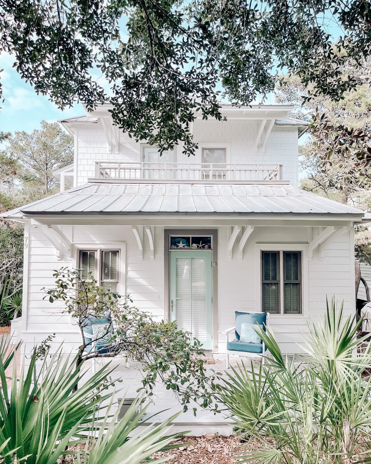
And today we are giving you the full tour of the most palm perfect cottage along 30a. We took inspiration from Palm Springs + New Orleans in preppy hues of pink, green, black and white for the entire interior and exterior re-design and I am just ecstatic with how it all came together. **keep in mind we will have a few last minute punchlist items to finish before rentals start but I couldn’t wait to share **

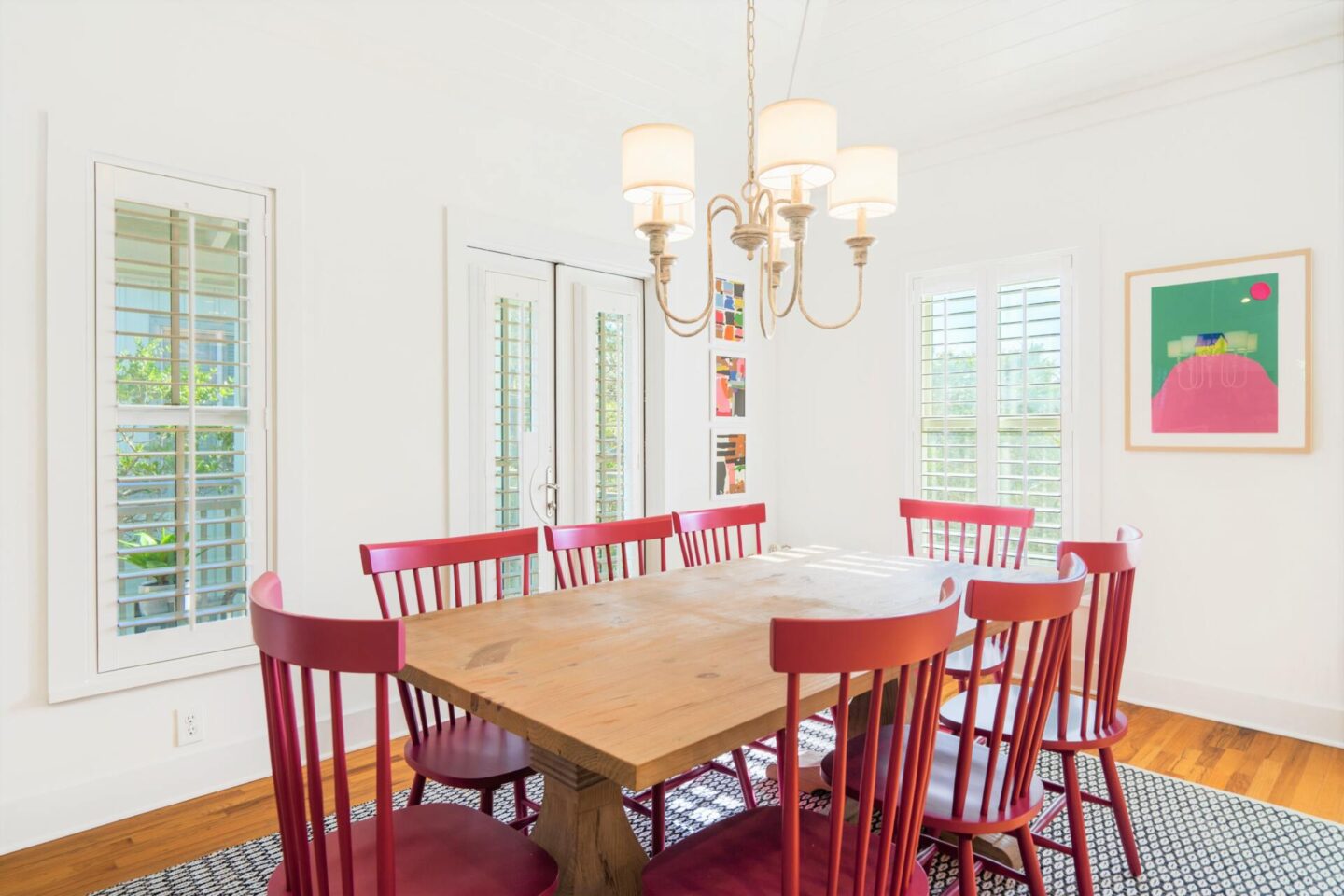
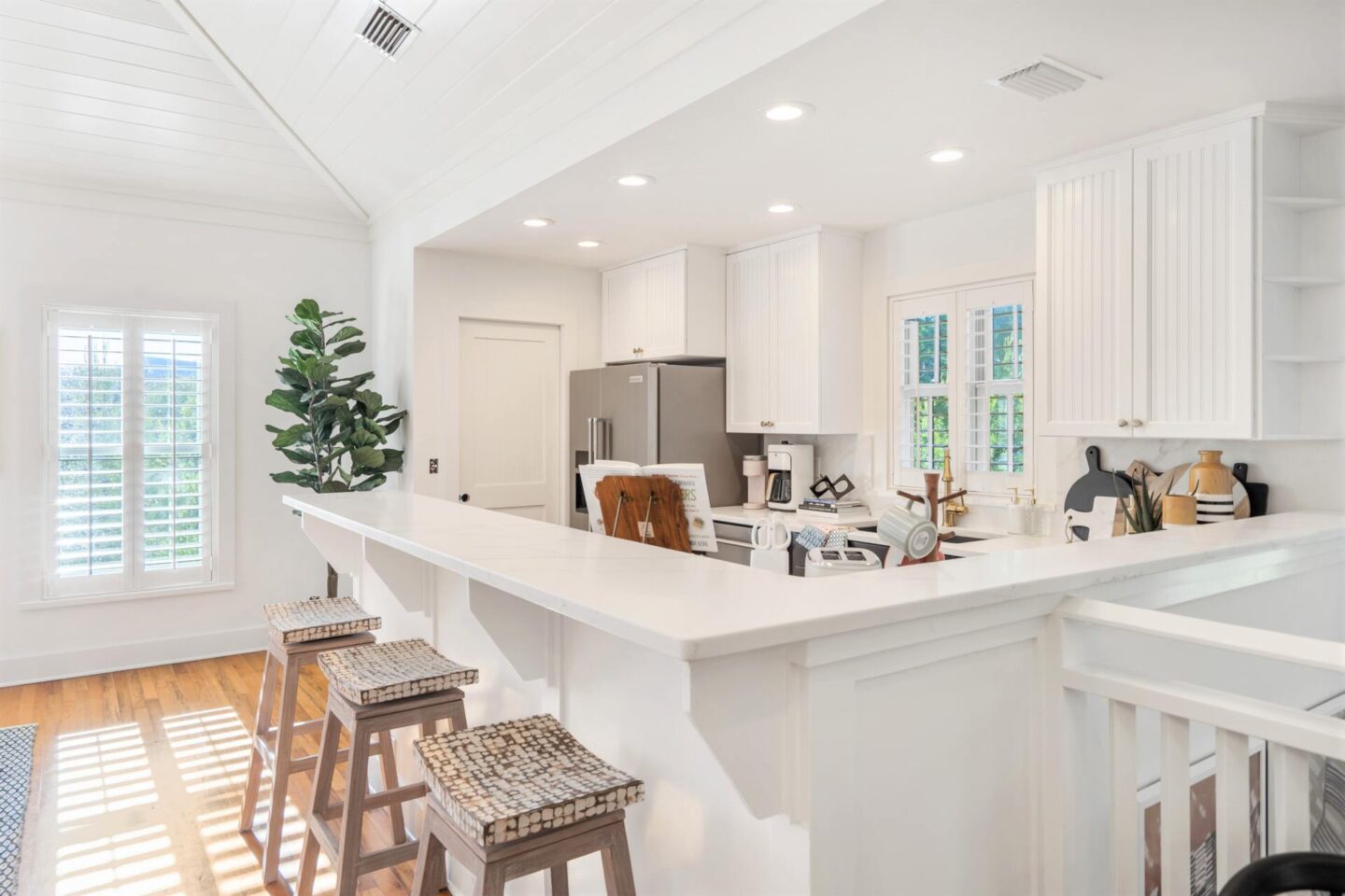
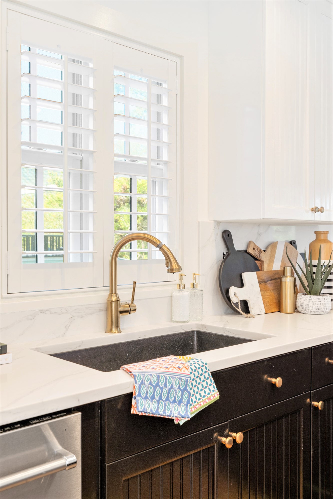
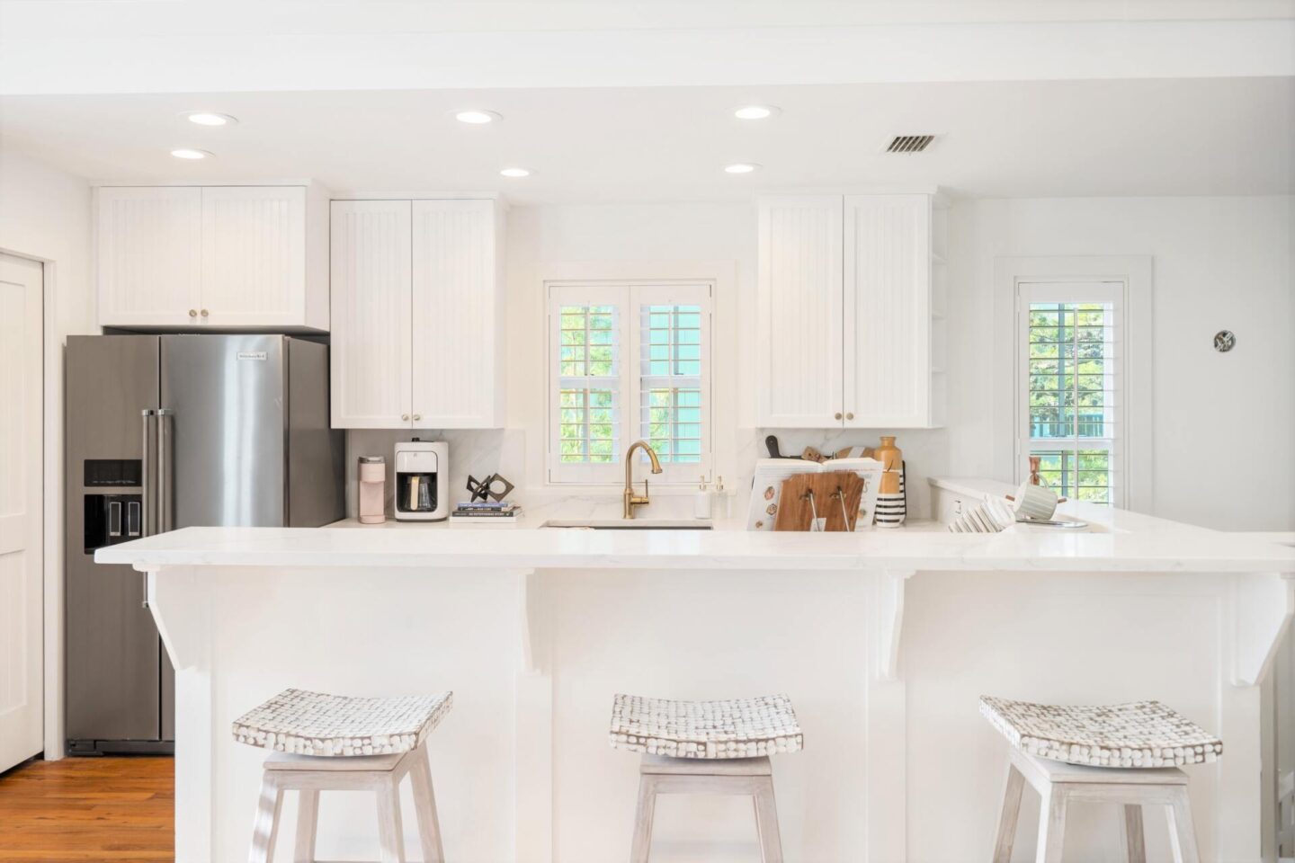
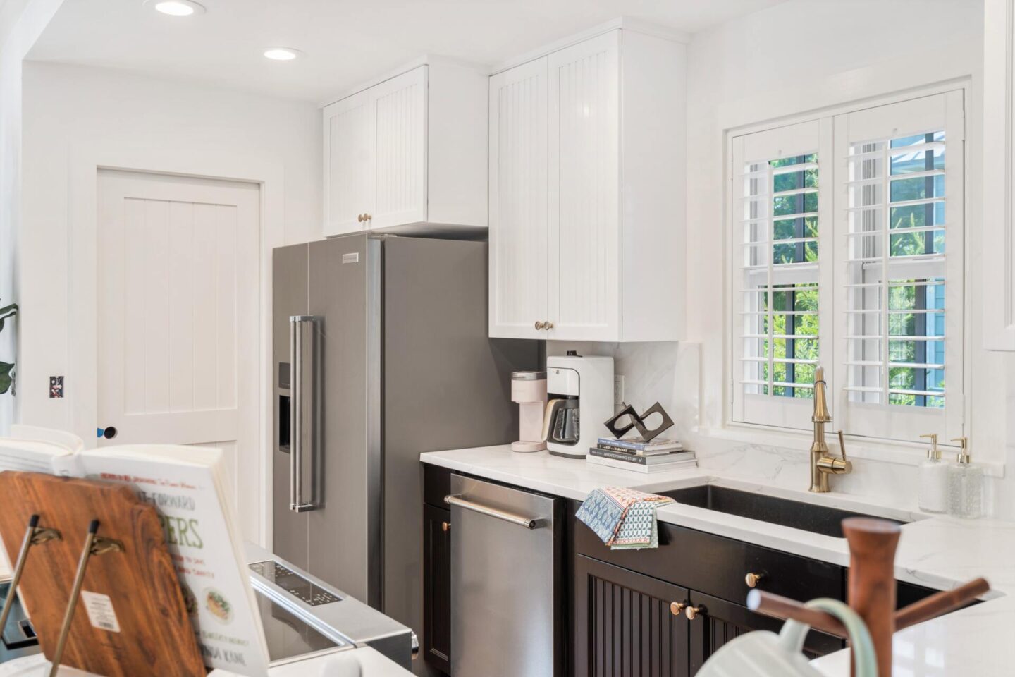
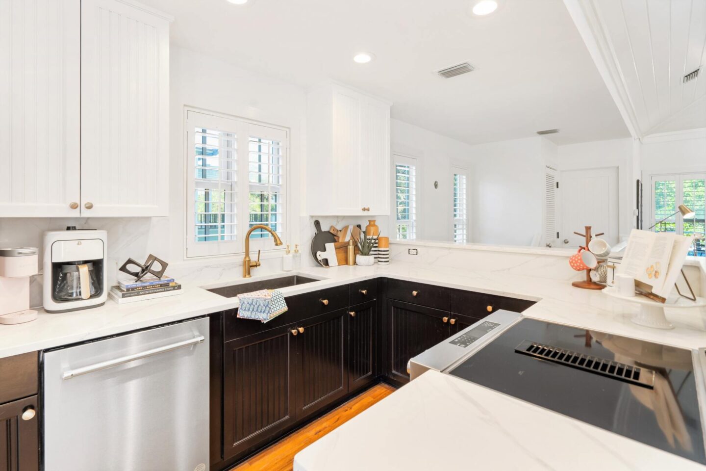
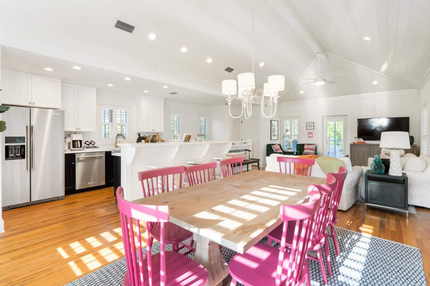
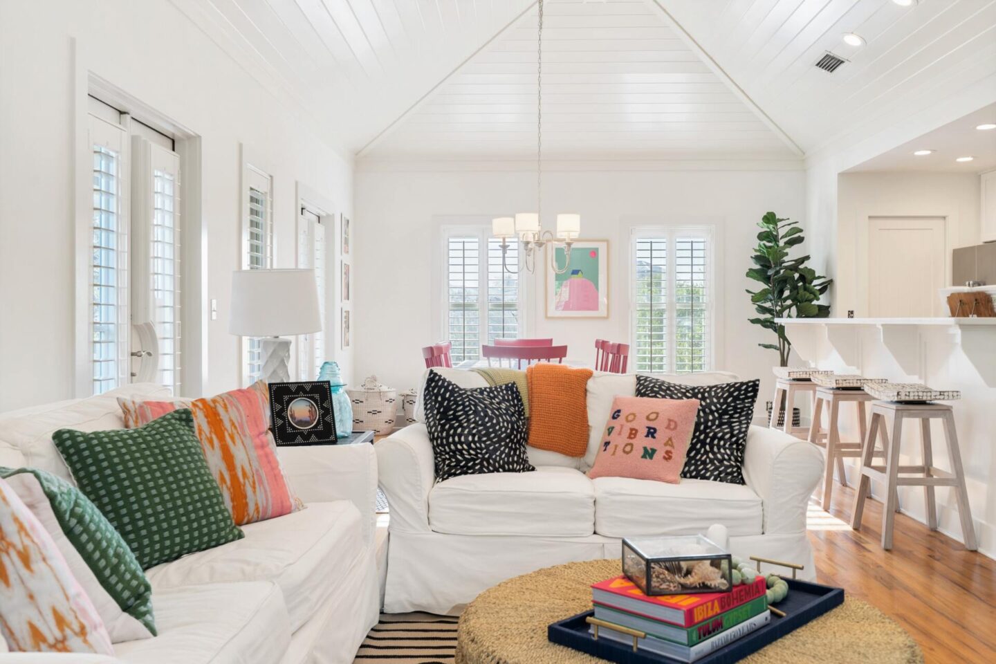
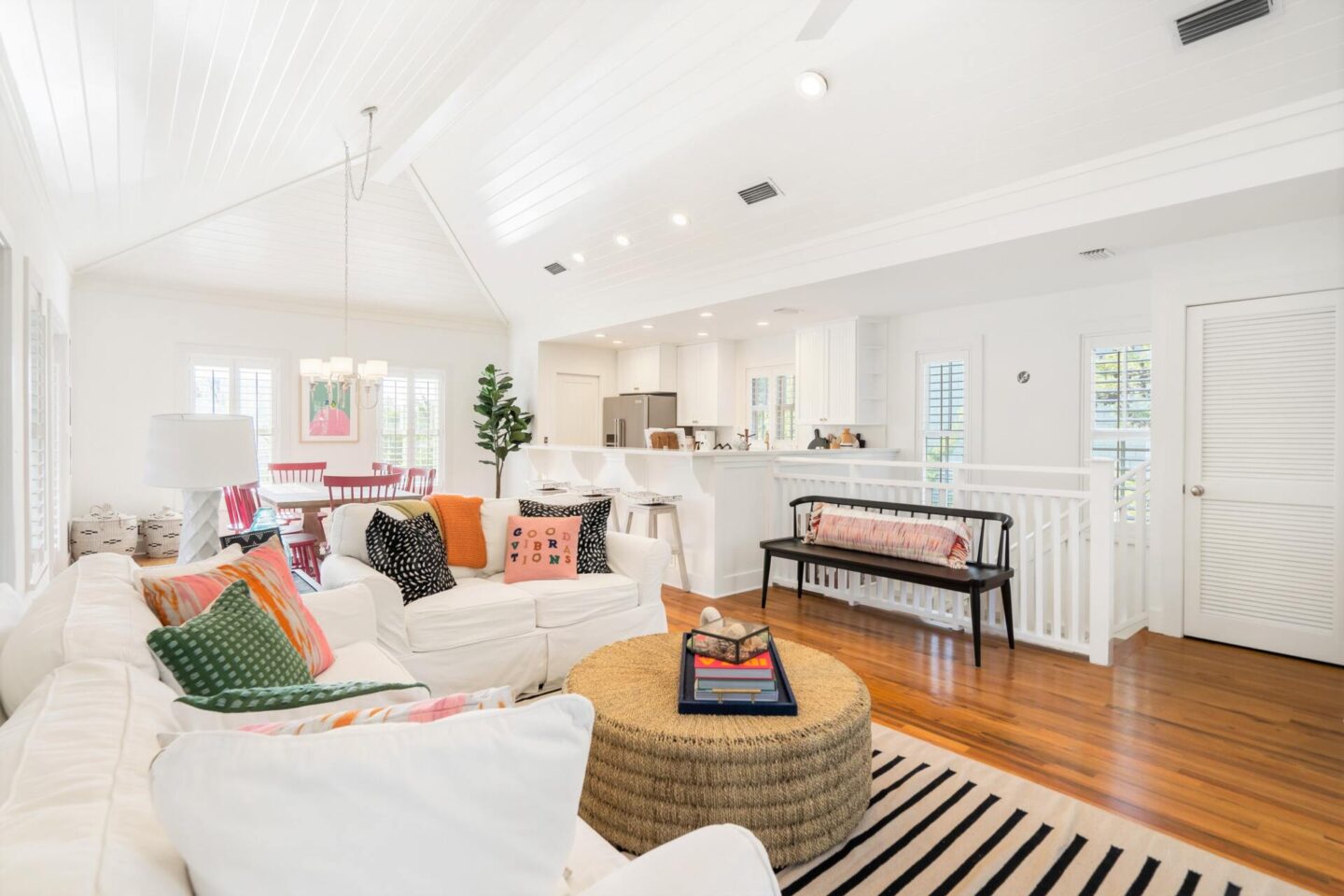
One thing I love about this space is how open, airy and BRIGHT it is… we used our go-to white paint configuration [Pure White by Sherwin Williams] to totally transform these rooms from drab to fab. When we purchased the home, the kitchen was dark and muted with earthy tones and that was an instant fix made even more special with the contrasting bottom cabinetry in black [Sherwin Williams Caviar].
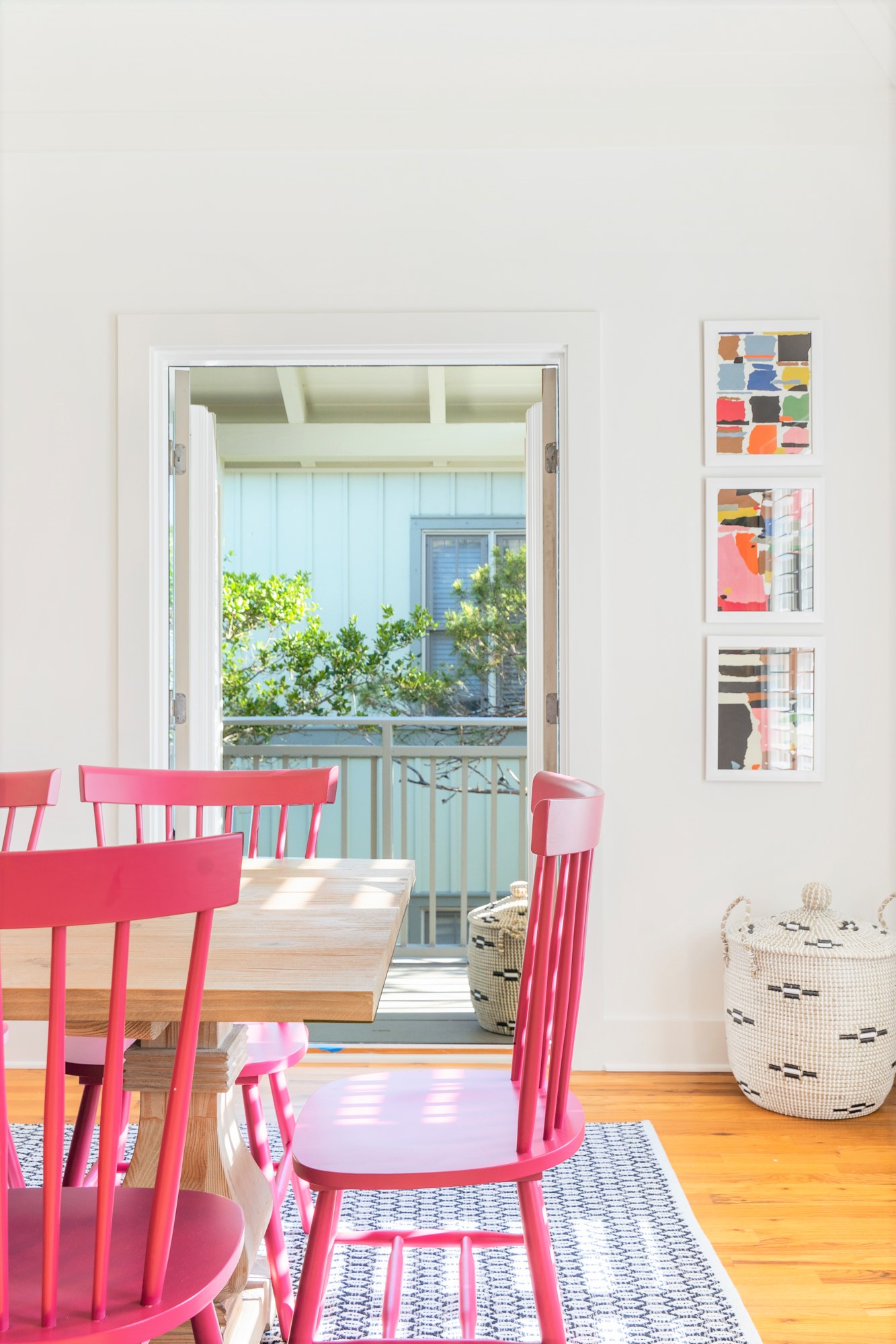
I then brought in all all sorts of fun pink and green accents, from the wall art to the dining room chairs and a simple, but chic indoo/outdoor rug for heavy traffic areas as well. A new black beaded chandelier is still en route but will make a huge statement to tie it all together and I’m still anxiously awaiting our 4 bistro barstools, too!
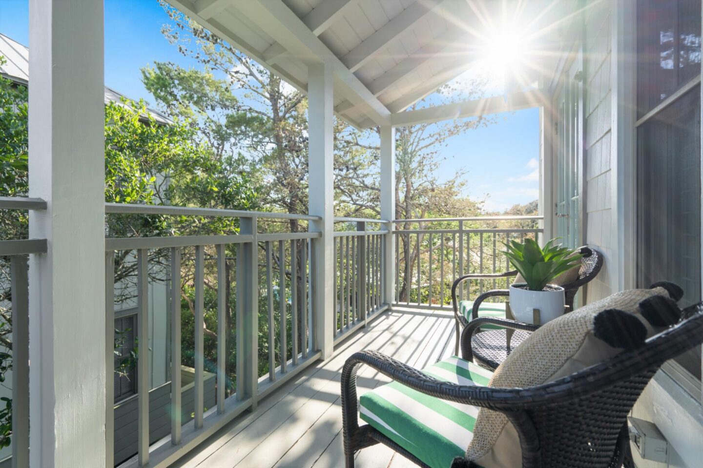
Right off the dining and kitchen is a darling side porch, perfect for sipping that early morning coffee and a bit of quiet time = one of my absolute favorite things to do on vacation, especially when it’s from the comfort of home sweet home in a cute + quiet neighborhood.
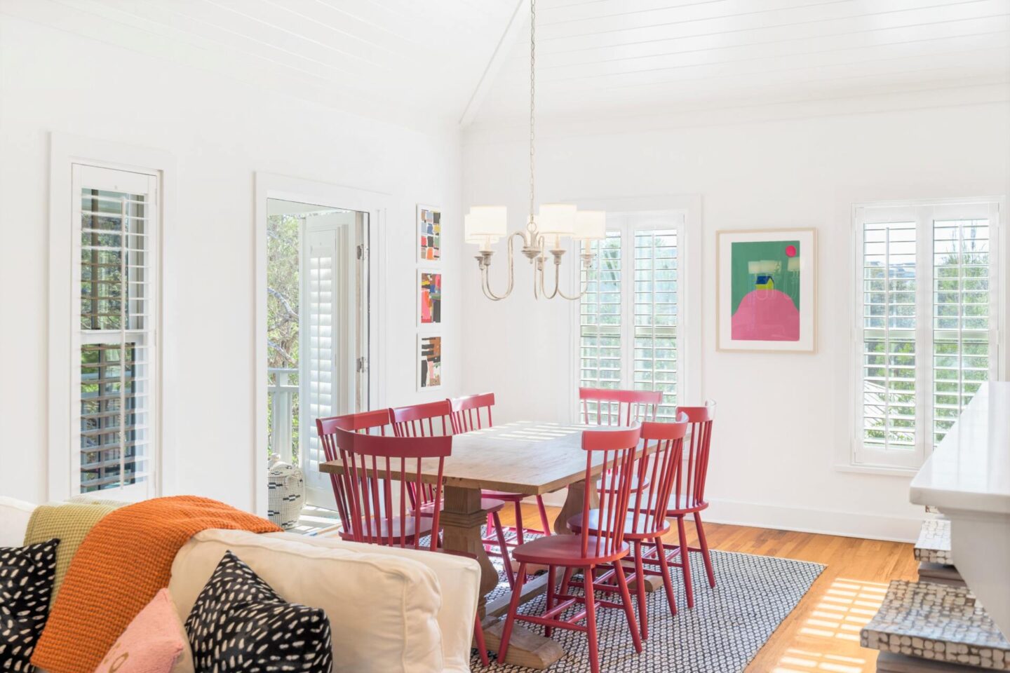

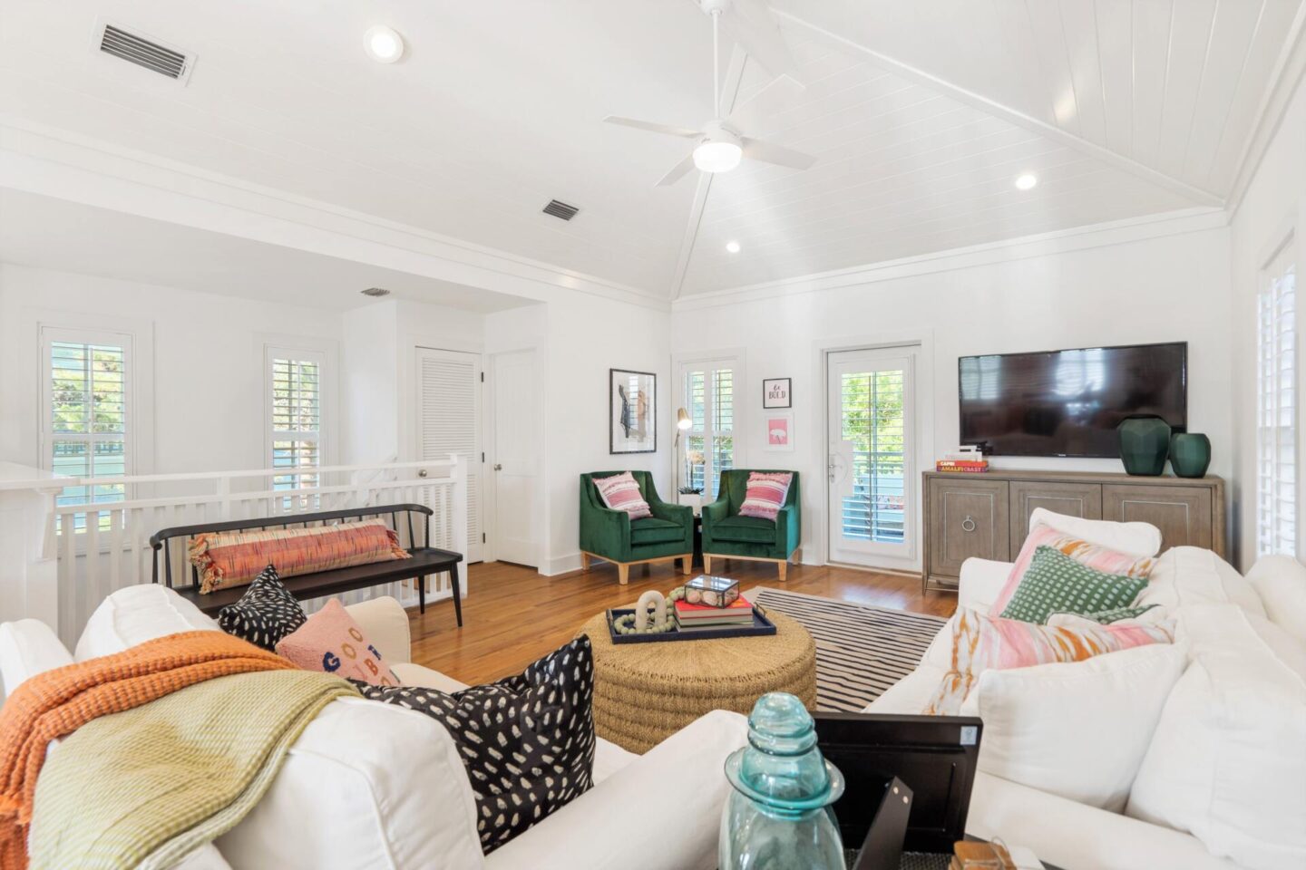
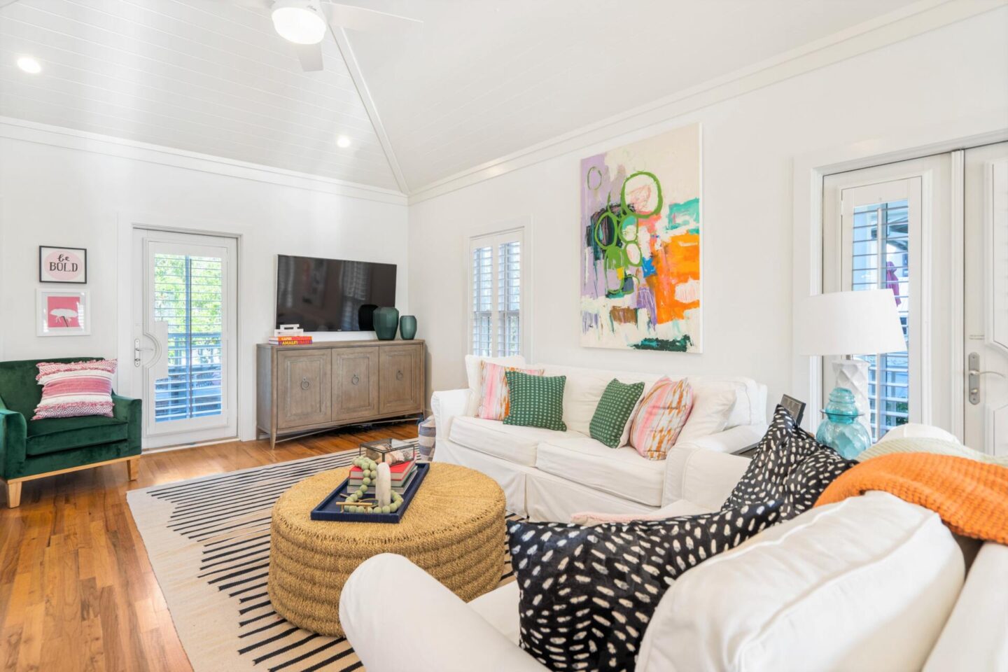
Moving right along to where the gathering gets good… the living room! Adjacent to the open concept dining + kitchen, it greets you with lots of airy light and sunshine for days. We decided to forego the traditional blinds and opted to add on southern style plantation shutters and I am over the moon thrilled with the installation process and the finished product. They can give you privacy when needed, but allows nature to make its mark on and bring in the light!
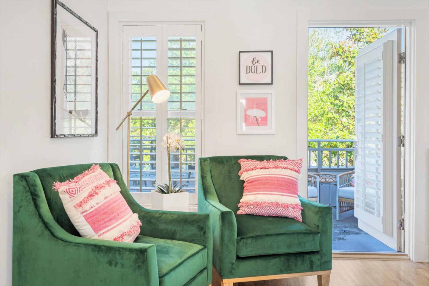
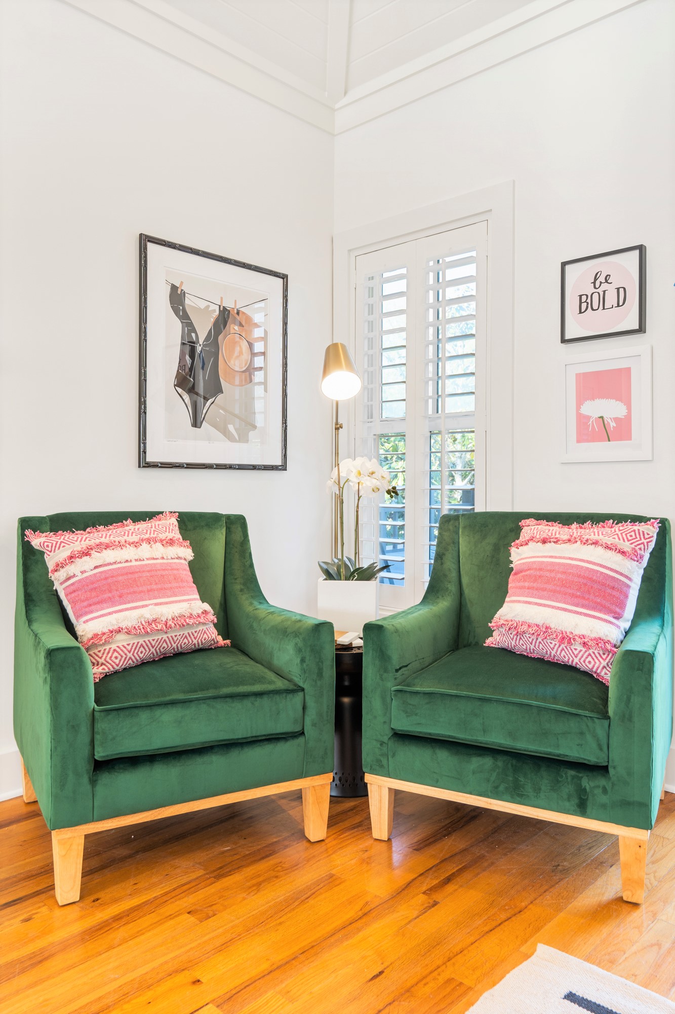
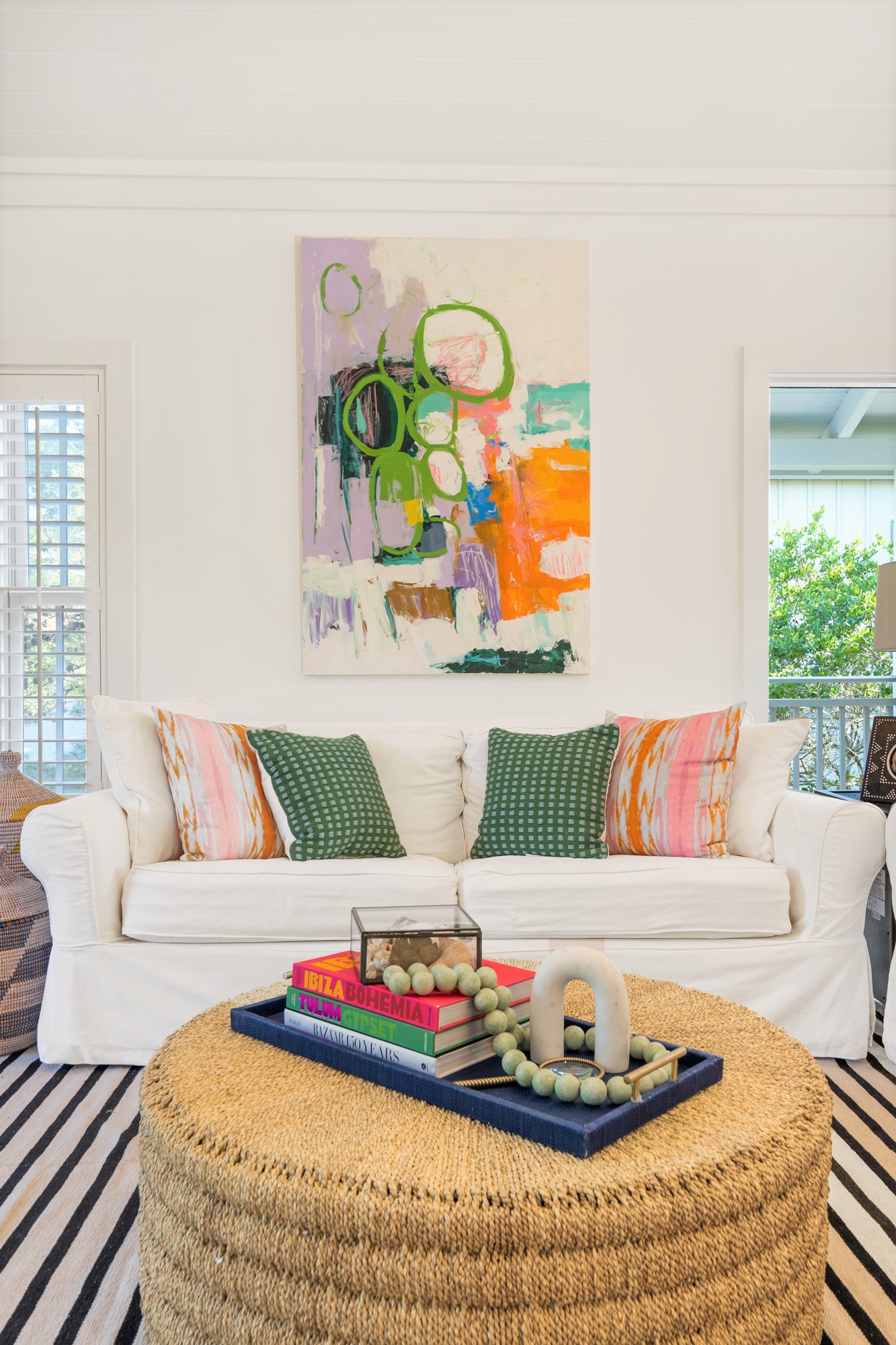
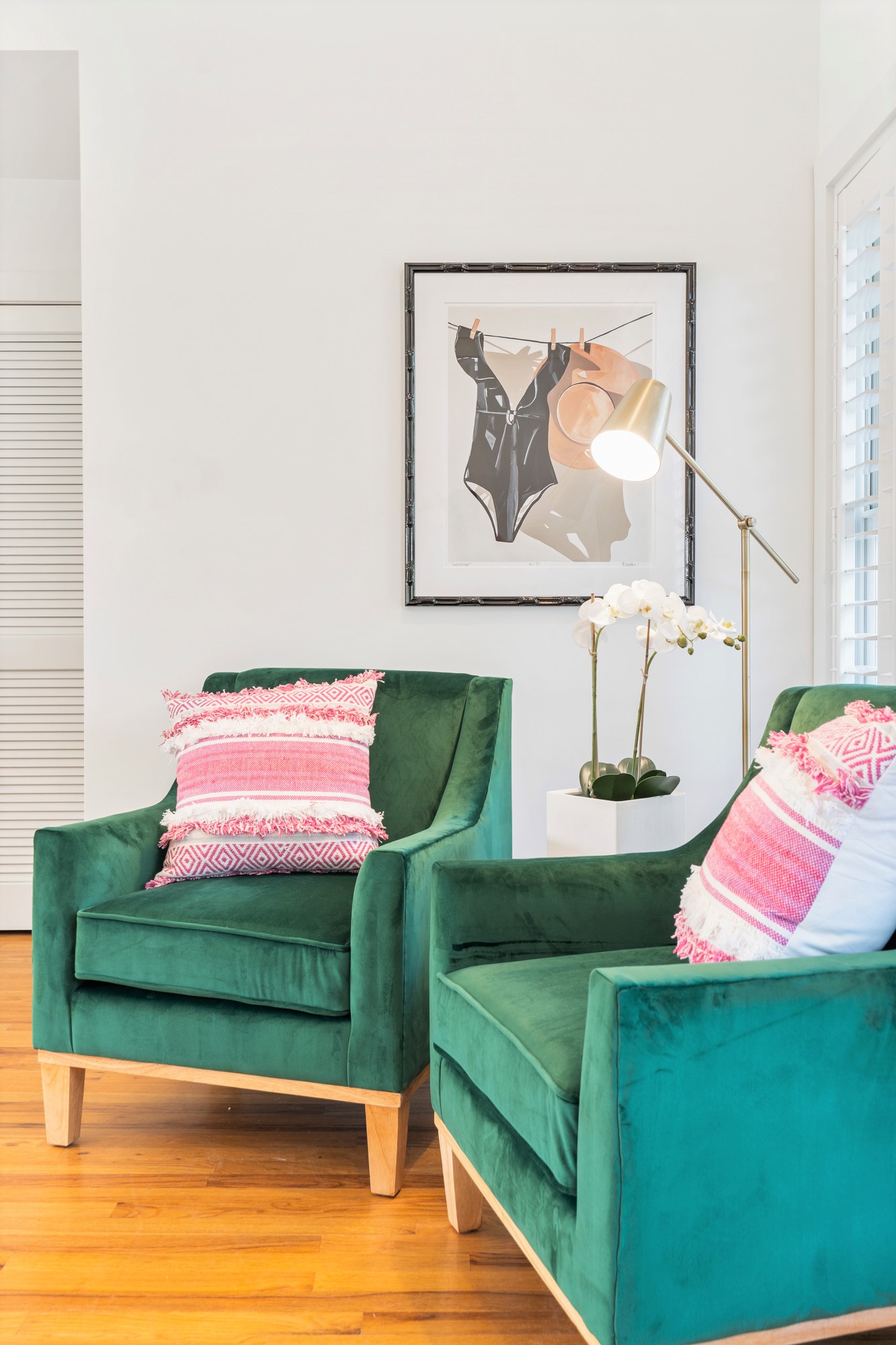
Luckily for us, we had a very clean + simple room to start with. We actually kept the white sofa and loveseat that we bought with the house because of its practicality and durability, but you know I just had to bring in major splashes of color to tie into the home’s design inspiration. And you know when I saw those green velvet arm chairs it was an instant add to cart kind of moment!
I absolutly love the “lived in” look and feel but still sophisticated and chic. You’ll see the walls are flanked with custom commissioned art from some of my favorite artists, including Brooke Lancaster, Lynnette Driver and printed pieces from Minted as well! The eclectic vibe totally suits the style of the house and I hope it’s inviting and cheerful when you visit.
We are still awaiting the arrival of our new media console table and a table lamp for the side table right next to the sofa but hands down this space is just how I hoped it would turn out and I’m thrilled to welcome our guests here!

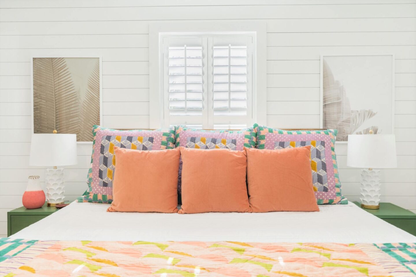
OK, now onto the bedrooms. One thing we love about this new house is that we can fit more people into it = which means you can bring your family [or friends for that matter]. All three bedrooms are located on the first floor for easy access, and we have two master bedrooms as well = so no one has to fight over the primary suite, as they both have adjoining bathrooms, too.
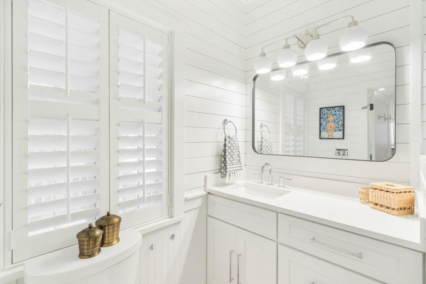
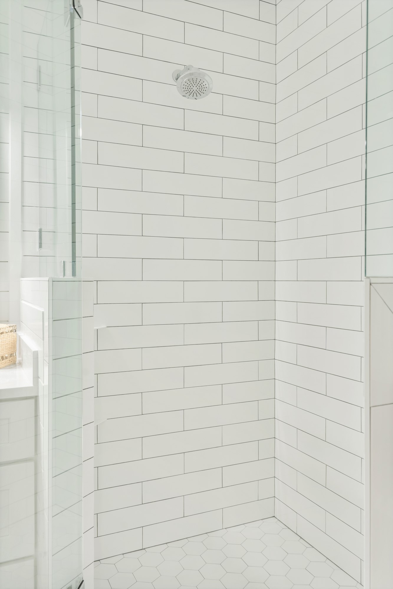
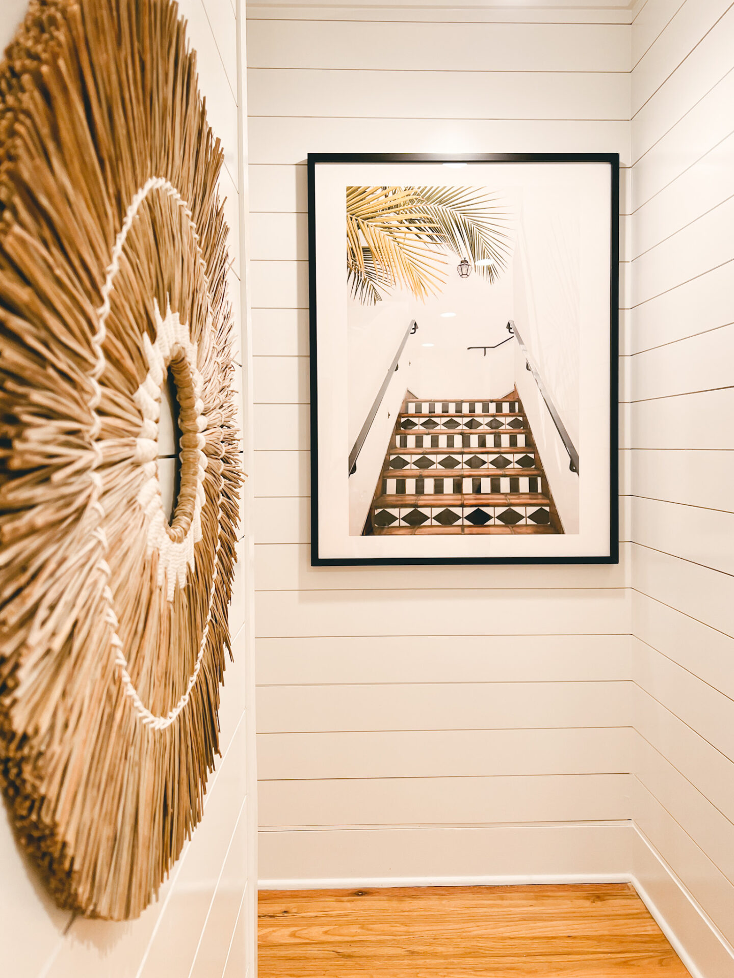
We installed shiplap throughout the bedrooms and all of downstairs and it’s so inviting… coupled with those classic plantation shutters you can open and close throughout the day = you’re going to get a proper night of sleep I promise! We completely renovated all the bathrooms into traditional white and black tones then pops of color with art and accessories… so glad we kept it all clean and simple and how everything came together!
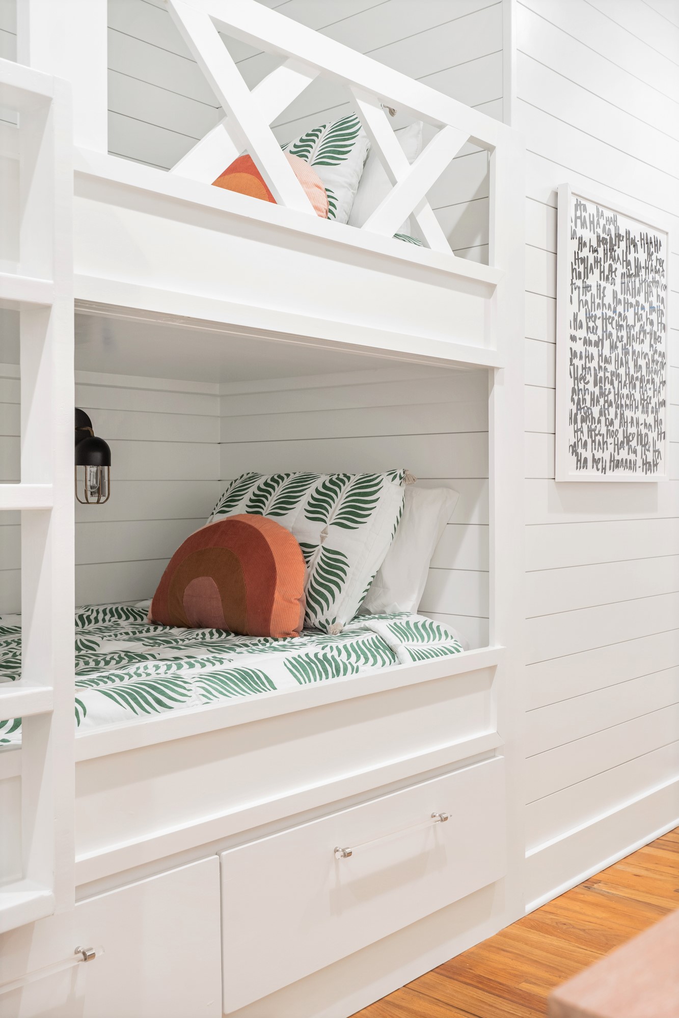
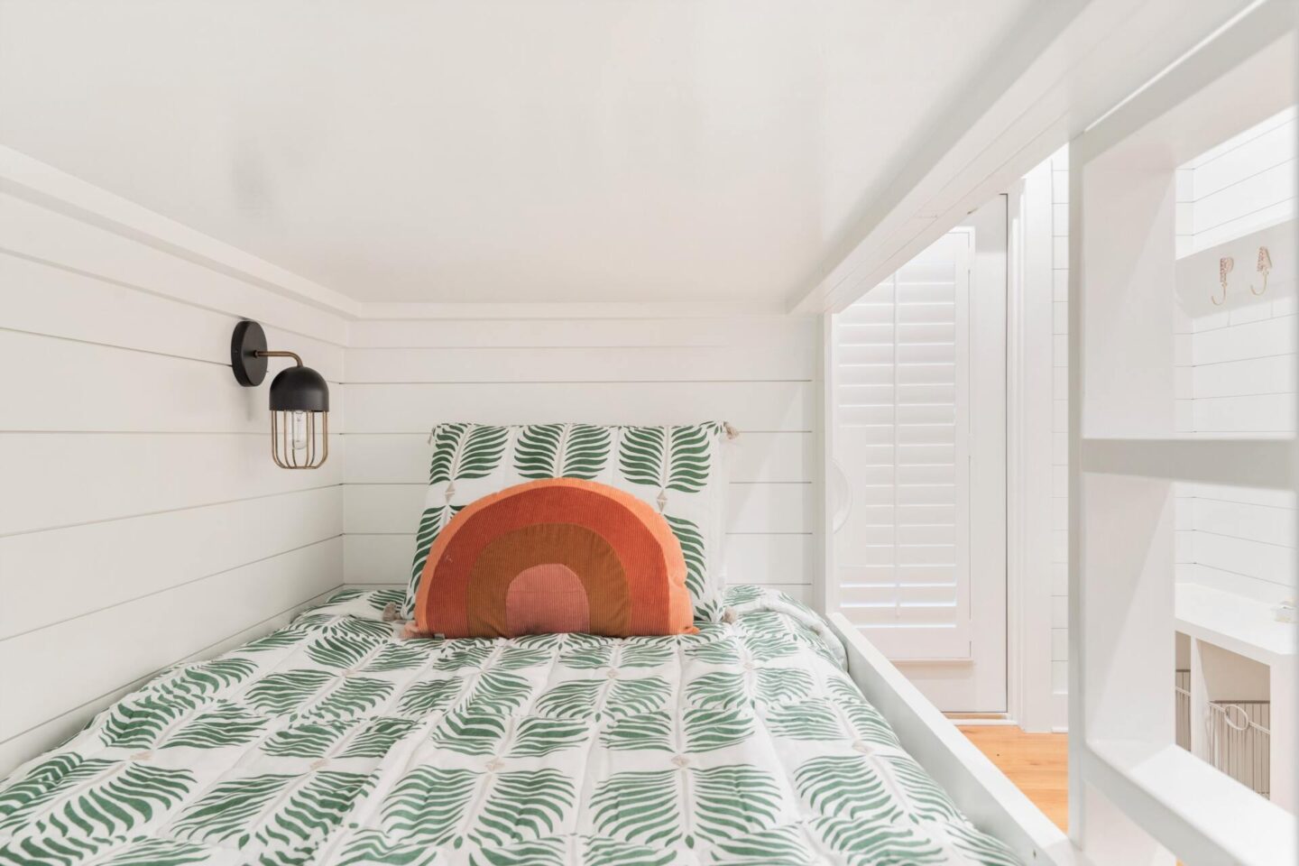
As for the queen over queen bunkroom, we are still waiting for those images to come back as the reveal of that room came a bit later than all the others because we had to finish the built-in cubbies, install the 40″ TV, complete the stairs and get everything cleaned… those images AND the adjacent bathroom will be coming to this post ASAP!
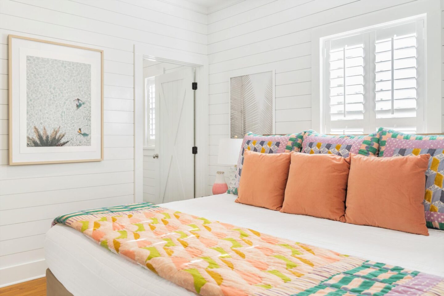
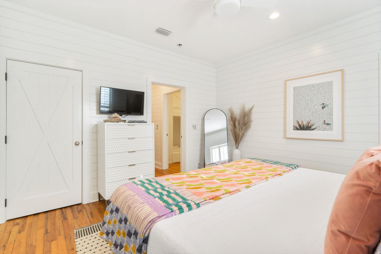
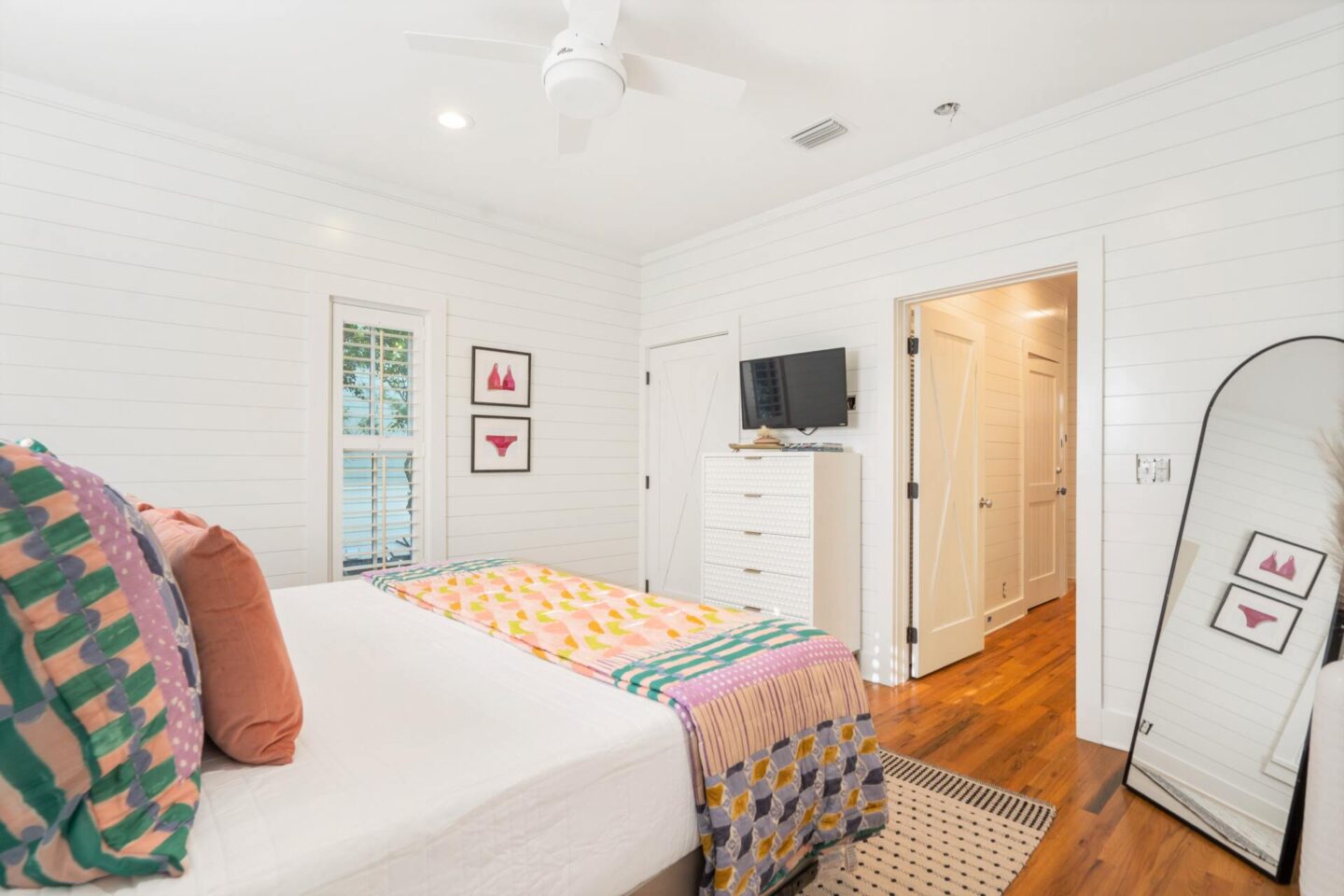
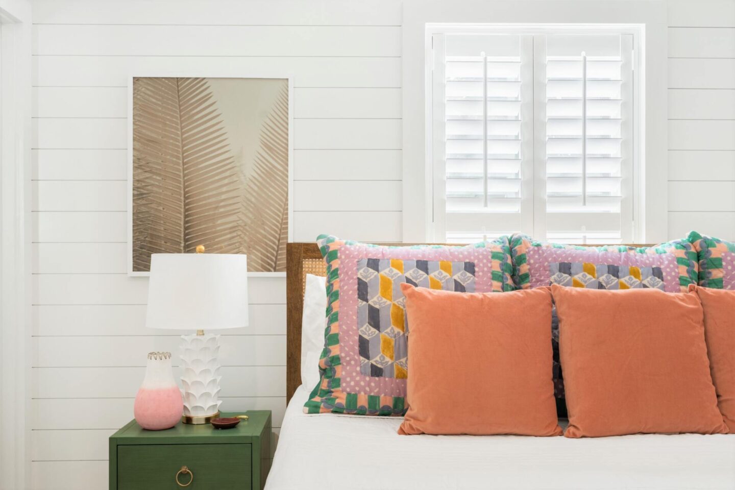
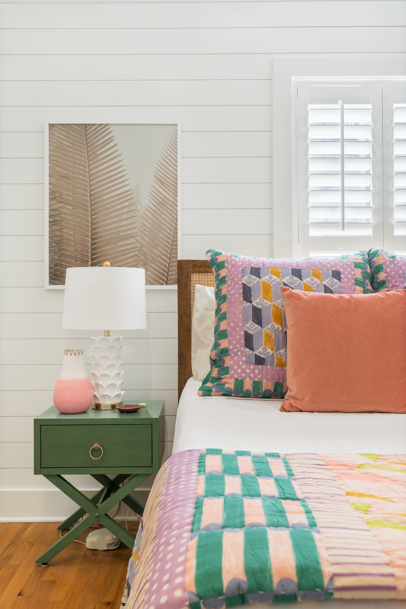
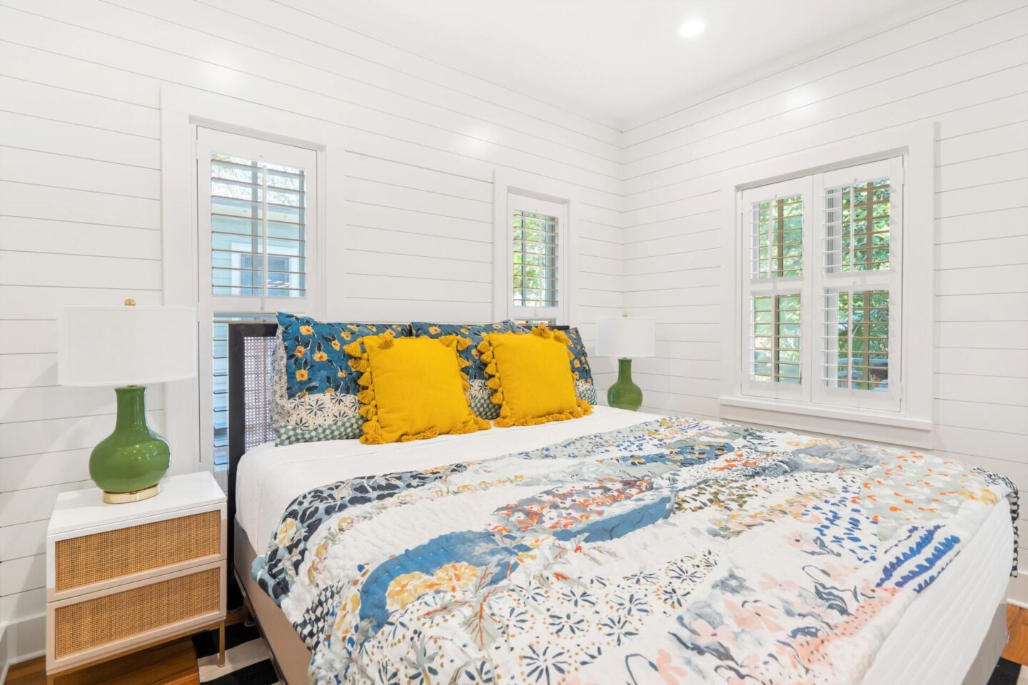
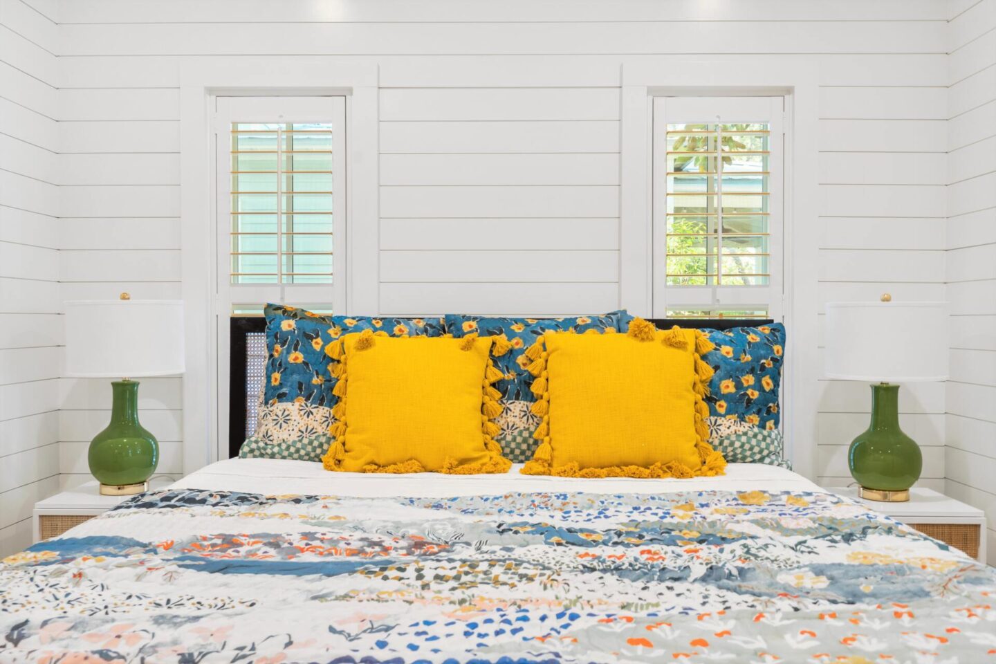
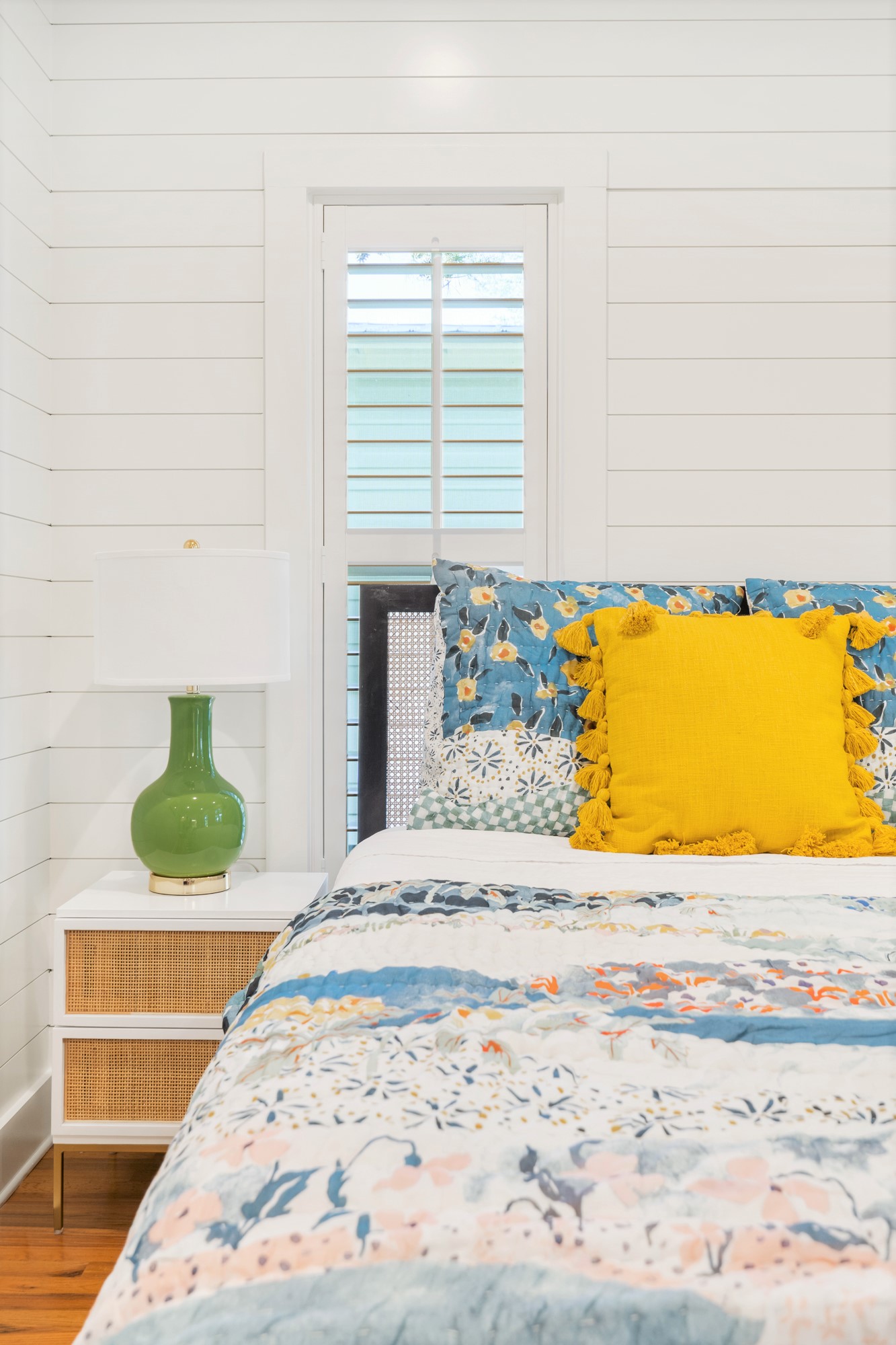

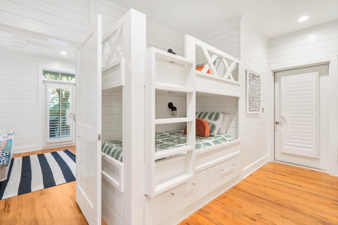
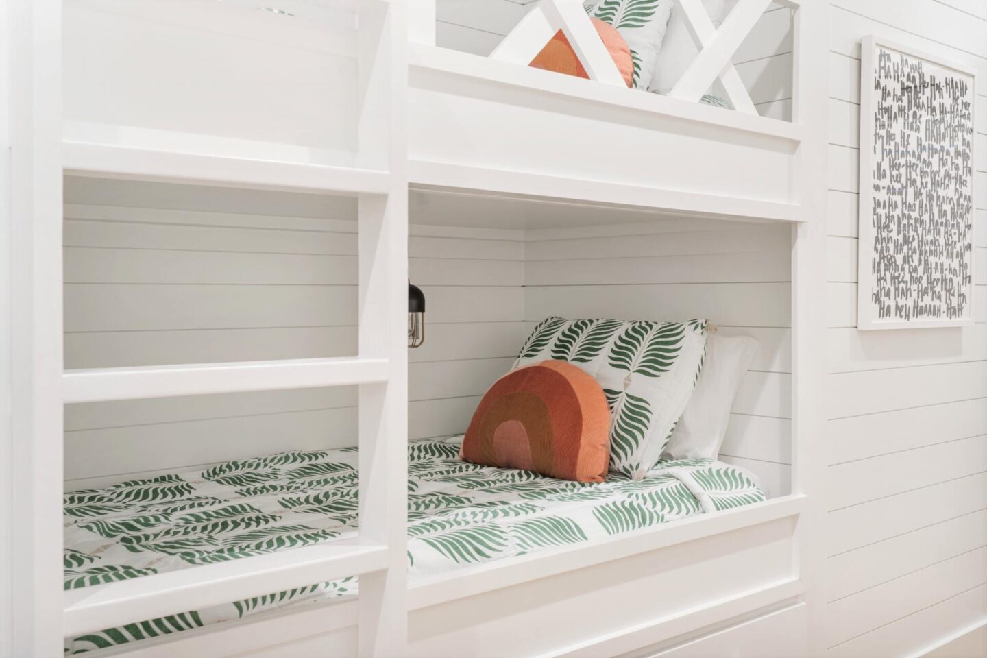
The bunks… otherwise known as the quintessential kids space within the new house. My girls go GAGA over bunks so it was a must that we revamp the current sleeping situation in exchange for something a little more sophisticated and functional. We added in side lights for nighttime reading and also a ladder for easy up and down!

Let’s be honest… you don’t necessarily come to the beach to be inside all the time [even during the winter you snowbirds!!] so it’s no surprise that I wanted to take a moment or two to show off the outdoor spaces at our new coastal cottage. Three separate + very distinct spaces for entertaining, dining, enjoying the sunshine, or just taking a load off after a full day at the beach. Two front patios flank the house on both floors with ample seating on the bottom by way of relaxed club chairs and then a dining set and conversational area on the second story! And let’s not forget the upstairs side porch off the dining room for a little secret hideaway.
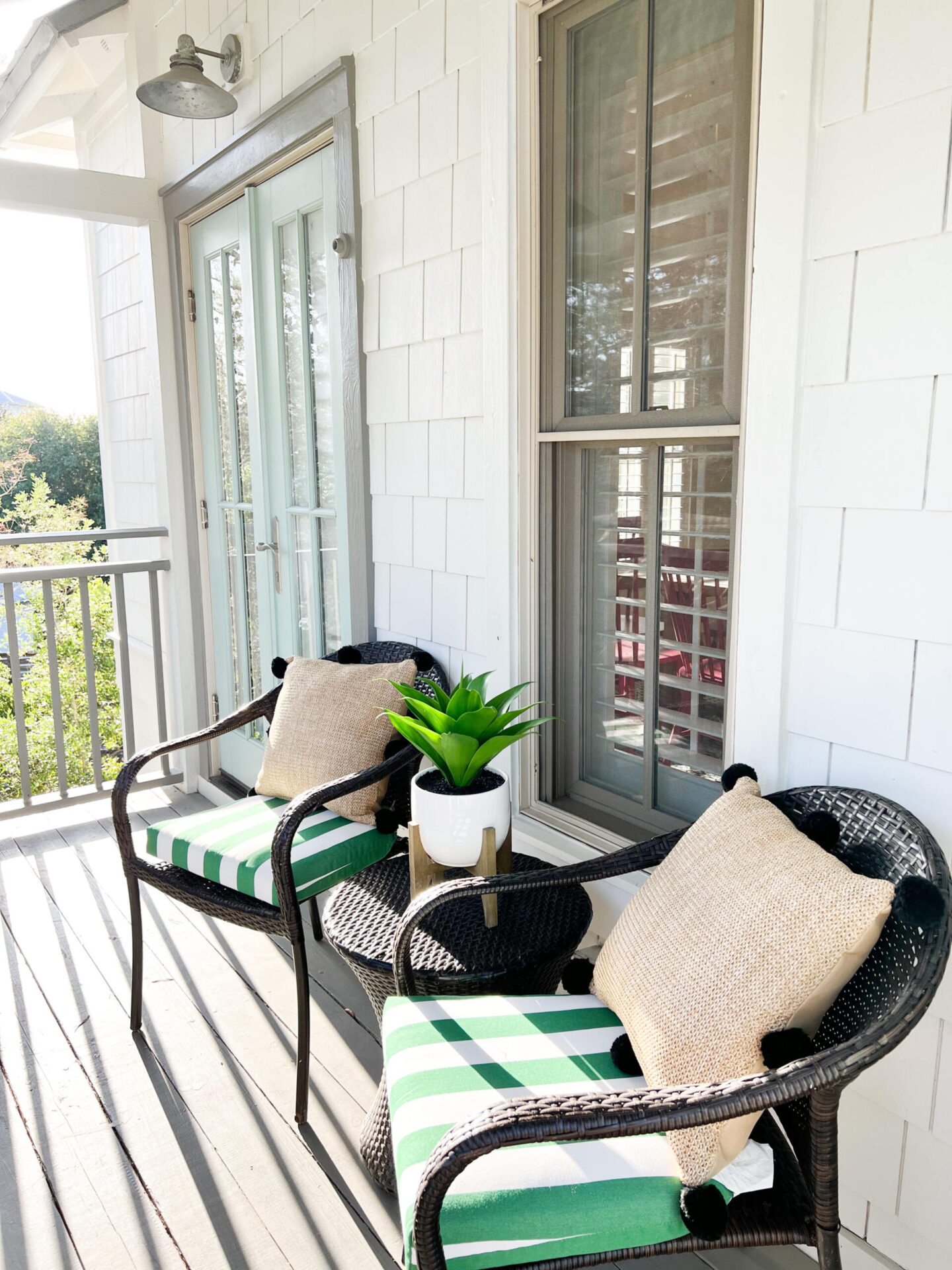
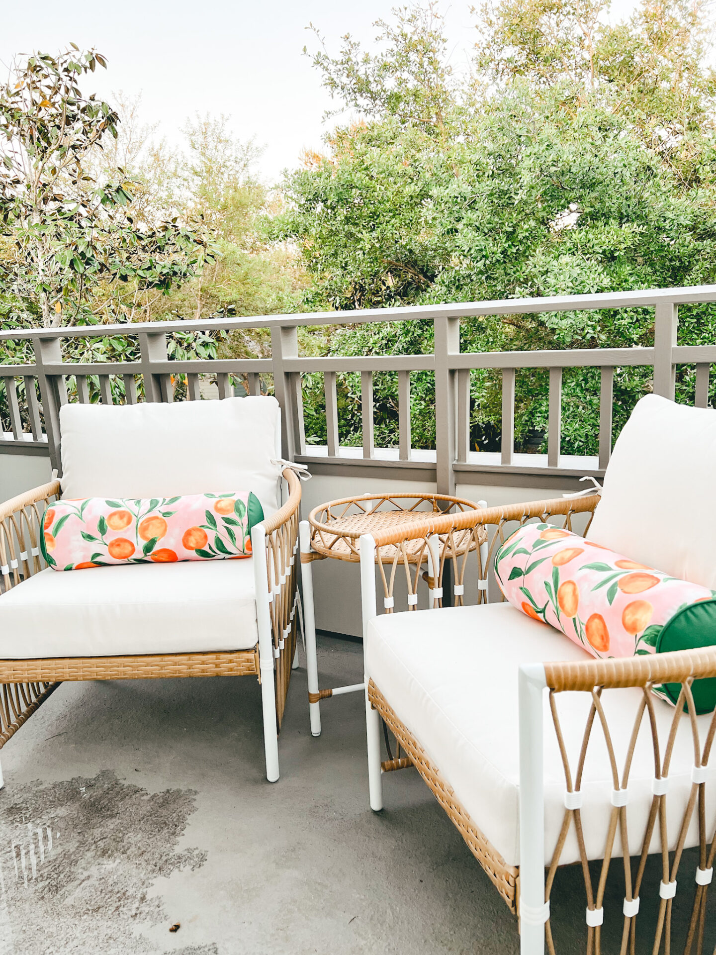
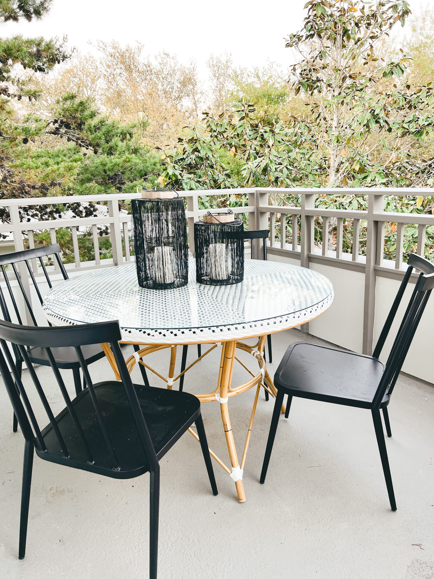
So, there you have it… the full top to bottom reveal. I can’t lie, even through the ups and downs this project has been an absolute ball to get to do with my hubby and I cannot wait to welcome our first set of guests very soon! Thank you all so much for following along.

Be the first to comment